BBC
Media TV Broadcasting


2015
London, UK
BBC iPlayer TV Guide
Find live programmes across BBC and other channels.
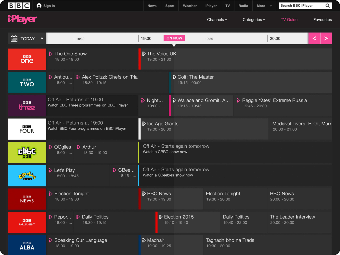
The 2015 BBC iPlayer TV Guide redesign, led as Senior UX & Interaction Designer in London. The goal: make live television fast and obvious to find inside a dense, multi-channel schedule, and rethink how viewers open a live programme, without losing the density that makes cross-channel browsing useful.
- 30%Time to find live programmeReduced the time users needed to find live programmes, improving access to live content.Reported
- 20%User engagement rateIncreased engagement with the redesigned TV Guide experience.
- 15%User satisfaction scoreImproved overall user satisfaction following the redesign.
Context
The BBC iPlayer TV Guide lets viewers browse programmes from the BBC and other broadcasters, catching up on anything from the past 30 days and looking ahead to the next 7. Its On Now section gives real-time access to live TV, alongside downloads for offline viewing and a recommendation feed built from a viewer's history.
I joined the 2015 redesign as Senior User Experience & Interaction Designer in London, and worked the full arc of the project: research and planning with the Research Team and Project Managers, then concept, wireframing, UX, interaction and UI design, a coded prototype, mockups, and MVT and A/B testing. It was a cross-functional effort with Creative Direction, Product Managers, UX Designers, User Researchers, User Testers, Software Engineers and Developers. A product audit of the existing guide's features, usability and technical architecture set the starting point. Some confidential details are deliberately omitted here.
Challenge
The redesign had one job: make it fast and obvious to find what is on live, without overwhelming the viewer. The guide needed a clear overview of the TV schedule with real emphasis on live programmes, and a rethink of how a viewer opens a live programme to reach everything they need about it (quickly, effortlessly, and without confusion.
The last round of testing had surfaced a specific set of friction points the redesign had to clear:
- no colour differentiation between the Off Air cell and the Programmes Available to Watch cell;
- an inconsistent dark-grey hover state on the Programmes Available to Watch cell;
- the More panel staying open while the viewer scrolled the schedule;
- the Off Air label not staying stuck as the viewer scrolled;
- the Watch Live programme not staying in view until its end time;
- abnormal-looking cells for programmes under five minutes, or under one minute;
- on some channels, the Watch Live programme sitting off-screen from the On Now line;
- a jarring, non-smooth schedule transition when the navigation arrows were clicked repeatedly;
- navigation arrows that were not sticky when the page scrolled up and down.
Success meant a seamless, enjoyable experience that reduced bounce rates and lifted satisfaction) but above all it meant getting live right, anchored to whatever was actually filling the schedule at a given moment, from returning formats like The Voice UK to catch-up favourites.
Approach
Work began with a product audit and a round of user research and testing on the existing guide. The audit and the sessions pointed at the same weak spots: the Off Air and Programmes Available to Watch cells shared a background colour and were hard to tell apart; the calendar icon was small and easy to miss; and the day links for Yesterday, Tomorrow and Weekend proved less useful than parts of the day would be.
What testing told us
Viewers struggled to find the live On Now section, and some asked directly for the old pink line back to locate it. They comfortably found the More Information, Programme Website and Add to Favourites actions and opened the More Info panel without trouble. Responses were mixed on whether that drop-down should close or stay open when they moved on. Several didn't realise the guide carried non-BBC channels, expecting them where they sit on a TV set. And once scrolled away, getting back to On Now was hard.
What we changed
- added a line to the On Now badge, so it reads at a glance what is on and how long it has been running;
- relabelled the schedule link from Full Schedule to the specific Full BBC Two Schedule, and gave channel icons a rollover state to signal they link to the full schedule;
- consolidated the date picker to a single button, enlarged the too-small calendar icon, and added ordinal indicators (st, nd, th) to the dates;
- with the picker simplified, replaced Yesterday / Tomorrow / Weekend with Morning / Afternoon / Evening / Late day parts;
- added a consistent link back to On Now that anchors to the left or right of the time bar as the viewer moves away, so live is always one tap away.
Decisions
One call shaped everything else: get live right first. With two defensible directions on the table, the redesign put the pink On Now line and a persistent path back to now ahead of every other refinement (live was what viewers came for, so it earned the priority.
An information architecture built around intent
The guide was mapped around what people were trying to do, not around internal content structures. From iPlayer, four top-level intents) Search, Browse, Watch and Manage, sit as peers. Browse is the TV Guide's home, alongside Channel, A-Z, Categories and Favourites as parallel discovery routes that all resolve to the same episode destination. Search bypasses discovery into its own results; Watch leads straight back to episode for anyone resuming. Mapping it this way kept the guide as one way in among several rather than a silo, while making every route converge on the same content page.
Three connected pieces of UX
- A responsive schedule grid (the broadcast schedule as time-based channel rows and programme tiles, scaling down to smaller screens without collapsing into unreadable text.
- Live programme interactions) focusing a tile expands a card over the artwork with the title, its time window and a one-tap play, plus a secondary More Info route for anyone who wants detail before committing.
- Time and calendar navigation, a persistent ON NOW marker on the timeline, arrow controls to step through the day, and a TODAY control that expands into day parts (Morning, Afternoon, Evening, Late) and a full calendar for looking further ahead.
Results
Early research (user surveys and analytics reviews) showed viewers struggling to find specific programmes and finding the interface cluttered, which set the direction: simplify the UI, clarify navigation.
After the changes, user testing measured the difference. The time it took to find a live programme fell by 30%. User engagement rose 20%, and overall satisfaction 15%. Post-launch feedback was overwhelmingly positive, validating the design choices.
Testing also confirmed which specific changes landed. Reintroducing the pink On Now line was well received and made live programmes easy to locate, and the consistent link back to On Now fixed the earlier difficulty of returning to live after scrolling. Viewers found the More Information, Programme Website and Add to Favourites actions easily, and the More Info panel tested well. Two things stayed unresolved: some viewers still didn't discover the non-BBC channels unless they scrolled (expecting them where they sit on a TV set) and responses stayed mixed on whether the More panel should close or stay open when moving on.
Reflection
Two directions would take the guide beyond this redesign. The first is deeper personalisation, using machine-learning to curate a programme list from a viewer's history and preferences. The second is a light social layer that lets viewers share and discuss favourite programmes inside the app, building a community around what they watch.
Prototype
The high-fidelity prototype modelled the TV Guide as a lean-back, focus-driven list. Each row opened with a programme title and time, then revealed more as focus moved onto it.
The first level surfaced a Full BBC One Schedule shortcut for browsing by channel. A deeper level revealed a thumbnail, play button and More Info action, so viewers could either watch immediately or read a longer synopsis without leaving the guide.
This progressive-disclosure pattern kept the default view scannable while preserving access to detail. It was the version taken into MVT and A/B testing.
UX Accessibility
Keyboard and assistive-technology navigation was mapped explicitly rather than left to the browser's default tab order. A numbered focus path runs from the main TV Guide navigation link, into the calendar and time-nav controls, then row by row through the channel grid: each channel's schedule link and each programme tile's hover state made independently focusable, so nothing that worked with a mouse required one. Prioritising date and time controls ahead of the programme grid meant a keyboard user could narrow to the right day first, then scan predictably left to right, channel by channel, without the focus order jumping around the page.
Disclaimers
This portfolio piece has been prepared to comply with applicable company policies and confidentiality agreements; any omissions of information or detail are deliberate and made to honour those obligations. The material is shown for portfolio purposes under Fair Dealing guidelines, and discloses no confidential or proprietary BBC information.
The work shown represents my own contribution and does not necessarily reflect the views or strategies of the BBC. Any forward-looking vision, ideas or strategies here are my personal perspective and may not reflect the organisation's business vision.
Data Protection Act 2018 and the Computer Misuse Act 1990 Fair dealing Disclaimer Sections 29 and 30 of the Copyright, Designs and Patents Act 1988.
Key facts
- Client
- BBC
- Year
- 2015
- Role
- Senior User Experience & Interaction Designer
- Industry
- Media TV Broadcasting
- Location
- London, UK
- Time to find live programme
- 30%
- User engagement rate
- 20%
- User satisfaction score
- 15%
What was the challenge in BBC iPlayer TV Guide?
The redesign had one job: make it fast and obvious to find what is on live , without overwhelming the viewer. The guide needed a clear overview of the TV schedule with real emphasis on live programmes, and a rethink of how a viewer opens a live programme to reach everything they need about it (quickly, effortlessly, and without confusion.
What did I actually do on BBC iPlayer TV Guide?
Work began with a product audit and a round of user research and testing on the existing guide. The audit and the sessions pointed at the same weak spots: the Off Air and Programmes Available to Watch cells shared a background colour and were hard to tell apart; the calendar icon was small and easy to miss; and the day links for Yesterday , Tomorrow and Weekend proved less useful than parts of the day would be.
What was the outcome of BBC iPlayer TV Guide?
Early research (user surveys and analytics reviews) showed viewers struggling to find specific programmes and finding the interface cluttered, which set the direction: simplify the UI, clarify navigation. Measured outcomes: Time to find live programme: 30%; User engagement rate: 20%; User satisfaction score: 15%.