Direct Ferries Ltd
Travel & Tourism - Ferry Bookings

2020
London, UK
Post Booking Experience App
The quickest way to view, use and manage your booking
The 2020 Direct Ferries post-booking app redesign, led as Lead Product Designer. After booking, ferry customers often don't know what to do, where to go, or whether their ticket will work at the port. I built operator-personalised, task-driven guidance (what to do, when, and where) to prevent missed sailings and cut support contacts.
- +20 pointsCustomer NPSCustomer NPS improvement in customer satisfaction
- -15%Support contact reductionSupport contact reduction change in operational efficiency
- -4 hoursTime efficiencyTime efficiency reduction in operational efficiency
Context
In 2020 I led the redesign and expansion of the post-booking experience inside the Direct Ferries native mobile app (iOS and Android), the area a customer meets after they have paid, when they need to view, use and manage their booking. The aim was to reduce port-day confusion and raise self-serve completion.
Direct Ferries is a multi-operator marketplace, so the hard part was never visual: it was turning uneven operator rules and API capabilities into one consistent, trustworthy experience that keeps customers from missing sailings and keeps support load down.
Who it was for
Post-booking served several groups, with two prioritised: first-time and occasional ferry travellers, who need a step-by-step mental model of what happens at the port, and drivers with vehicles, for whom arriving at the wrong terminal or queue is high-stress and costly. Foot passengers wanted smooth boarding with no paperwork surprises; frequent travellers wanted speed. Across all of them the job was the same: know the check-in and boarding steps for your operator and route, hold the correct ticket artefact, barcode, voucher or reference, understand how it will be accepted, and reach the right place at the port with enough time.
My role
A team of approximately 6 to 10 people included Product Owners, iOS, Android and backend/API engineers, QA, and me as Lead Product Designer. I worked closely with Customer Service, Commercial and operator relationships, Legal, and analytics/BI. I owned the post-booking UX strategy, booking-type taxonomy, information architecture and key flows, interaction design and prototyping, workshop facilitation, research synthesis, usability testing, accessibility-by-design decisions, and engineering specifications including fallback behaviours. Product Owners held roadmap sequencing; engineering and commercial held the API contracts; Legal held final wording.
Scope and timeline
In scope: My Bookings, including import and add booking, booking details and status where operators supported it, personalised check-in and boarding guidance, barcode and voucher handling, port directions and reminders, permitted self-serve actions such as cancellation, and operator contact plus Direct Ferries escalation. Deliberately out of scope: full responsive-web parity, operator-side flows beyond what the APIs exposed, and live status for operators without reliable data. The work ran across 2020: discovery and stakeholder workshops early in the year, booking taxonomy and prototypes at mid-year, usability testing and iteration mid to late year, and a build with phased release by operator capability in late 2020.
Challenge
After booking, ferry customers often do not know what to do, where to go, or whether their barcode or voucher will actually work at the port. The task was to personalise post-booking guidance by operator and route so the app always answers three questions in plain language: what to do, when to do it and where to go. It also needed to show the correct ticket artefact for that operator and route, preventing missed sailings, reducing post-booking support contacts and improving NPS.
Why it was hard
- Operator variability was the product. Ticket-acceptance rules, check-in windows and artefact types all changed by operator and route.
- Integrations were uneven. The UI could only show what operators exposed through their APIs, and those capabilities were inconsistent.
- Edge cases were high stakes. Unclear guidance led directly to missed sailings, last-minute stress and immediate support escalation.
- Non-negotiables had to hold. Operator rules, mandatory disclaimers, documentation requirements, ticket terms and clear customer-service escalation paths all had to remain accurate.
The failure scenarios we designed against
- Customers went to the wrong place at the port, such as the wrong terminal, ticket office or gate.
- A barcode or voucher was not accepted because the customer brought the wrong artefact or misunderstood the flow.
- Customers missed the sailing because of unclear check-in windows, missing documents or poor directions.
Where the evidence came from
The uncertainty appeared repeatedly in App Store and Google Play reviews and in customer-service conversations tagged around check-in, barcode, voucher and port directions. The scope was to identify the scenarios where a customer could board without a trip to the ticket office, which meant understanding the different operators, routes and boarding technologies behind each flow.
Approach
I worked on the problem as a system rather than a set of screens, across four phases in 2020.
1) Discovery and alignment
- Audited the existing post-booking area and mapped the end-to-end customer journey with Customer Service to find the highest-impact failure scenarios.
- Facilitated workshops with Product, Customer Service, Commercial, operator relationships and Legal to define the value proposition and translate operator requirements into user-facing tasks.
2) Define a scalable system
- Built the booking-type taxonomy and an operator and route capability matrix to decide what the UI could reliably show.
- Defined rules-based templates, for example: if booking type equals voucher exchange, show “exchange at office” steps and suppress “go to gate” prompts.
3) Prototype, test and iterate
- Built high-fidelity prototypes and tested realistic scenarios across booking types in two usability rounds.
- Iterated on hierarchy, content clarity and reminder triggers based on observed misunderstandings, especially the assumption that barcode means boarding pass.
4) Build and phased release
- Partnered with engineering and commercial to ship one component set that operator-specific rules and data could populate.
- Released in phases by operator capability, watching support tags, engagement and failure rates before widening coverage.
Research that fed it
- Customer interviews: approximately 8 to 12 recent bookers, especially first-timers and customers who had contacted support about check-in, boarding or barcode issues.
- Survey: approximately 150 to 400 responses on post-booking confidence and support intent.
- Usability testing: two rounds of moderated remote testing, approximately 5 to 6 participants each, using realistic scenarios by booking type.
- Existing data: App Store and Google Play reviews, customer-service conversations, support tags and post-booking analytics.
What shipped
- My Bookings entry point, including import and add booking, to reduce friction reaching trip information.
- Booking overview and status, including operator, route, time, passengers and vehicle, with live status where supported.
- Booking-type identifier shown early to remove ambiguity.
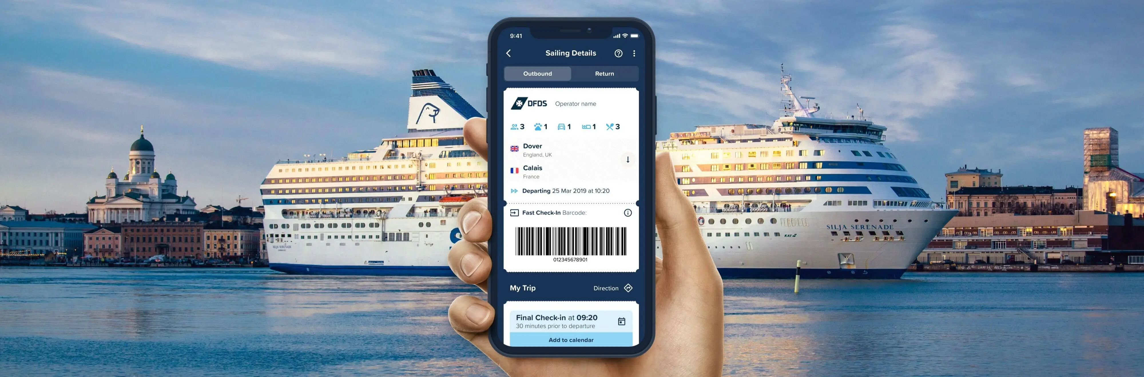
- Step-by-step check-in and boarding guidance personalised by booking type.
- Barcode, voucher and reference display with explicit explanations of what each artefact was used for.
- Port directions built into the step flow to prevent wrong-location errors.
- Add to calendar to reduce missed-sailing risk, and manage cancellation where ticket terms allowed it.
- Operator contact and Direct Ferries escalation so customers knew who to contact and when.
Decisions
The old experience was an information-heavy booking page where operator differences were easy to miss and the next action was unclear. My central decision was to restructure it into a task-driven layout and drive it from data, not bespoke screens.
Task-driven information architecture
Your trip: the key facts, including operator, route, departure time, passengers and vehicle.
What you need to do: personalised check-in and boarding steps driven by booking type.
Get there: directions and time planning.
Manage booking: the actions that ticket terms and operator policy actually allowed, such as cancellation.
Rules-based UI instead of one-off screens
Rather than hand-build a screen per operator, I defined content templates, such as “if booking type equals X, show steps A, B and C”, plus the required and optional data fields per operator. The layout and navigation stayed within a stable Direct Ferries structure; operator-specific rules were injected only where they materially changed what the customer needed to do. That was what allowed a consistent experience to scale across uneven APIs.
Capability-based personalisation, with a safe fallback
Always shown: operator name, route, departure time, terminal address, check-in rule, booking-type label, customer name, passenger count and vehicle information where relevant.
Shown when available: live status, delay information, terminal gate details, barcode validity rules and deep links to operator systems.
Fallback when missing: say so plainly, default to the safest guidance and always offer a contact or escalation route. Fallback-first was a deliberate stance: when operator data was unreliable, the UI admitted it rather than guessing.
Patterns that held up under stress
Plain-language booking-type labels surfaced early so customers stopped guessing what their barcode meant.
Step numbering and time framing built a mental model and reduced panic reading.
Do and Don’t guardrails prevented costly wrong turns, such as going to the gate before exchanging a voucher.
Artefact microcopy explained what each barcode or voucher was used for.
Directions inside the step flow placed location help where the customer needed it near departure.
Progressive disclosure broke dense text into step cards, with detail expanded only when needed.
Reminders, on the customer's terms
Reminder triggers supported time-critical behaviour while respecting consent: add-to-calendar prompts after booking, check-in-window and document reminders 24 hours before departure, port directions on the day, and delay or cancellation alerts where operator capability existed. Users controlled these through OS push permissions and in-app toggles, aligned with existing email and SMS preferences.
What we chose not to build in version one
No full operator white-labelling across every screen.
No deep change-everything self-serve flow where APIs or terms did not support it.
No live status or tracking for operators without a reliable feed.
Content governance
Because operator rules were legally and operationally sensitive, content passed through approvals with Customer Service and Commercial for accuracy, Legal for disclaimers, and Product for final sign-off.
Results
Three findings shaped the redesign, each backed by evidence rather than opinion:
- “Barcode” is not a universal boarding pass. Customers assumed “barcode equals board”, but the meaning changed by operator and route. Evidence: recurring support themes, repeated review complaints and the same misconception across multiple usability scenarios.
- Customers lacked a step-by-step mental model. Without sequencing, anxiety spiked near departure and people defaulted to contacting support. Evidence: repeated “what do I do now?” questions in interviews and customer-service transcripts.
- Status uncertainty eroded trust. Where delays or cancellations were not communicated clearly, or data was unavailable, customers contacted support more and rated the experience lower. Evidence: explicit feedback themes in research notes and post-booking review patterns.
The turning point: a taxonomy that made personalisation scalable
I translated the research into a four-type booking taxonomy that could drive UX logic, content and fallbacks across every operator:
- Barcode-at-gate: the barcode is the boarding pass.
- Barcode-for-check-in: the barcode is used at the ticket office to receive a boarding pass.
- Voucher exchange: the customer exchanges a voucher or reference for the ticket at the office.
- Reference or ID-based check-in: no usable barcode, so the booking reference and documents are required.
What happened
I measured a post-booking cohort, comparing approximately 4 to 8 weeks pre-launch against approximately 4 to 8 weeks post-launch, with phased operator coverage expanding over approximately 4 to 6 weeks.
- Post-booking NPS: +20 points uplift in the post-booking cohort.
- Support contacts: -15% for the tagged reasons the redesign targeted, represented as 100 → 85.
- My Bookings engagement: higher completion and usage of key post-booking tasks, represented as 100 → 125.
- Checkout completion: improved search-to-payment-to-confirmation conversion, represented as 100 → 108.
Guardrails
Crash and performance measures, refund and cancellation request rate, contact rate per booking, payment failures, booking-import failures and negative-review velocity showed no material degradation during rollout.
Specific commercial metrics are withheld under confidentiality policy. Results are expressed as indexed changes, cohort-based uplifts and operational measures validated through analytics and support tagging.
Reflection
Three lessons carried beyond this project:
- Confidence beats completeness. A short, personalised step flow reduced anxiety more than adding information. Booking-type labels and “This is used for…” microcopy did more than another paragraph would have.
- Customer Service is a product signal. Embedding Customer Service early turned anecdotal complaints into a repeatable taxonomy and measurable outcomes.
- Design needs a system, not screens. In a marketplace with uneven APIs, the capability matrix, rules-based templates and explicit fallbacks were the only scalable way to stay consistent without overpromising live data.
Where I would take it next
- Expand self-serve into a full journey portal: let customers manage more within ticket terms, supported by stronger operator API coverage and robust handling when operators decline a change.
- An AI chatbot for FAQs and simple requests: explored but not shipped in version one. It would require clean booking-type and contact-reason tagging, consent management, reliable operator status feeds and a proven escalation path.
- Smarter proactive messaging: extend core reminders into richer disruption handling, dependent on reliable real-time status and clear per-channel notification controls.
- Connected travel and engagement ideas: keep IoT and gamified reviews separate from travel-critical tasks so they never distract from check-in and boarding.
What we deferred, and why
- Full operator white-labelling: deferred to preserve a consistent Direct Ferries UX and reduce maintenance overhead.
- Universal live status: deferred wherever operator data was not reliable enough to earn trust.
- Deep change flows: deferred where APIs or ticket terms could not support a safe, predictable self-serve experience.
Prototype
I created high-fidelity, scenario-driven prototypes to validate the new task structure and booking-type logic before build. The prototypes focused on the moments that caused the most support contacts: identifying the booking type, understanding where to go at the port, and knowing whether the barcode, voucher or reference would be accepted in that specific route flow.
Skills Applied
Defined the target experience (“confidence beats completeness”) and prioritised a task-driven structure over an info-heavy booking page.
Reframed booking details into task sections: “Your trip”, “What you need to do”, “Get there”, and “Manage booking”, with dynamic steps by booking type.
Created plain-language booking type labels, step numbering, and Do/Don’t guidance; ran approvals with Customer Service, Commercial, Legal, and Product.
Synthesised interviews, surveys, reviews, and support tags into the 4-type taxonomy and the priority set of failure scenarios to design against.
Specified rules-based content templates and fallback behaviours so engineering could ship consistent components rather than one-off operator screens.
Project Methodologies
Facilitated cross-functional workshops (Product, Customer Service, Commercial, Legal) to align on user needs, operator constraints, and non-negotiable requirements (rules, disclaimers, escalation paths).
Mapped the end-to-end post-booking journey to identify high-friction moments (barcode misuse, wrong port location, missed check-in windows) and prioritise fixes that reduce support contacts.
Defined a 4-type booking taxonomy and a capability matrix per operator/route to scale a consistent UX across uneven APIs, including safe fallbacks for missing data.
Ran two rounds of moderated remote tests using realistic scenarios mapped to booking types (barcode-at-gate vs office check-in vs voucher exchange).
Designed and reviewed flows with WCAG 2.1-oriented checks (contrast, Dynamic Type, tap targets, VoiceOver/TalkBack spot checks) for high-stakes travel instructions.
UX Accessibility
I treated accessibility as a safety feature: port-day instructions must be readable, scannable and usable under stress.
Checks performed
- Contrast spot checks
- Dynamic Type sizing
- Tap target sizing
- VoiceOver and TalkBack spot checks
- Readability review for critical instructions
Fixes implemented
- Increased tap targets for primary CTAs such as Directions and Show barcode.
- Ensured the barcode screen included non-colour cues and readable labels.
- Replaced long text blocks with scannable headings and step cards.
Rollout & Monitoring
The redesign shipped as a phased release by operator capability and route over approximately 4 to 6 weeks. The rollout was a monitor-then-expand loop: after each phase I watched support tags, My Bookings engagement, booking-import failures and contact-CTA usage, and only widened coverage once the guardrail metrics held steady, with no material degradation observed across the rollout.
Disclaimers
Some information and details have been excluded for confidentiality. This case study is shared for portfolio purposes under Fair Dealing guidelines: it avoids disclosing confidential commercial information, and any sensitive results are expressed as indexed changes, ranges, or cohort-based uplifts.
Data Protection Act 2018 and the Computer Misuse Act 1990
Key facts
- Client
- Direct Ferries
- Year
- 2020
- Role
- Lead CX Product Designer
- Industry
- Travel & Tourism - Ferry Bookings
- Location
- London, UK
- Customer NPS
- +20 points
- Support contact reduction
- -15%
- Time efficiency
- -4 hours
What was the challenge in Post Booking Experience App?
After booking, ferry customers often do not know what to do, where to go, or whether their barcode or voucher will actually work at the port. The task was to personalise post-booking guidance by operator and route so the app always answers three questions in plain language: what to do, when to do it and where to go . It also needed to show the correct ticket artefact for that operator and route, preventing missed sailings, reducing post-booking support contacts and improving NPS.
What did I actually do on Post Booking Experience App?
I worked on the problem as a system rather than a set of screens, across four phases in 2020 .
What was the outcome of Post Booking Experience App?
Three findings shaped the redesign, each backed by evidence rather than opinion: Measured outcomes: Customer NPS: +20 points; Support contact reduction: -15%; Time efficiency: -4 hours.