Squawka
Football Media Company

2016
London, UK
Squawka MatchBoss
A full-season football prediction product where the game was easy to play, but difficult to return to.
MatchBoss was Squawka's free-to-enter, real-money football prediction product. I designed the consent, selection, submission, scoring and live-match experience across the Euro 2016 beta and the 2016 to 2017 Premier League season.
- 55.1%In-play email open rateAverage open rate for in-play emails across gameweeks 6 to 13.Reported
- 23.5%In-play email click rateAverage click rate for in-play emails, the highest click rate among the emails sent.
- 60.9%Results email open rateOpen rate for results emails, which was the highest email open rate.
- +35%Sign-up conversionSign-up conversion improvement in conversion performance
- 37.7%Order conversionOrder conversion change in conversion performance
Context
Squawka MatchBoss was Squawka's own product, not client work: a free-to-enter, real-money football prediction contest built on the same licensed Opta feed that powered the editorial site. Squawka was a London football-media company whose audience already came to the site for live match data and analysis.
The mechanic was not picking a fantasy squad. Players predicted the most valuable player in each of ten teams, with leaderboard ties broken by the summed performance points of their ten picks.
Two runs
Euro 2016 beta: June to July 2016. A Man of the Match contest with a £20,000 Match 10 jackpot for a perfect set and cash prizes up to £1,000 for the Top 20 leaderboard. Squawka promoted it on its own podcast on 3 June 2016, with former England defender Ledley King discussing picks on the episode.
Premier League season: launched at gameweek 6 on 24 September 2016 and ran through at least gameweek 27 in March 2017, with entry promotion still active into May 2017. It was free to enter, with £250 to first place each week and £25 spot prizes paid down the leaderboard.
The product was designed against a £1,000,000 insured jackpot, but that figure is excluded from the visible case study because the surviving record does not yet include a dated April or May 2016 source for the revised covered amount.
I was Lead Product Designer, game experience and conversion, leading a small UX team and working across web, mobile, social and video with Product Managers, Content Strategists and Sales.
The user research programme was co-authored with Sunny Bhogal, Thomas Johnson and Rikkesh Mistry, and reported on 6 July 2016 after the Euro 2016 beta. Product owned the contest calendar and prize structure. Engineering built the live scoring integration against the Opta feed. Commercial owned the prize and insurance arrangements that set the compliance requirements. My contribution covered the game experience end to end: the interaction style guide, selection and submission flow, scoring model, landing-page architecture and funnel analysis that drove the changes.
The problem
MatchBoss asked football fans to hand over real identity data, including name, email, username, date of birth and phone number, inside a match-day countdown running down to the second before submissions locked. Compliance and urgency were pulling against each other on the same screen.
Two funnels ran over the Euro 2016 beta, from 6 June to 10 July 2016, and together they contradicted the team's assumption that the game itself was the hard part.
Registration: 2,404 sessions started the funnel and 32.5% completed it. The largest drop was step three, which asked for date of birth and phone number: 44.1%, or 615 sessions.
- Name and email: 2,404 sessions, 29.2% drop-off.
- Username and password: 1,701 sessions, 17.9% drop-off.
- Date of birth and phone: 1,396 sessions, 44.1% drop-off.
- Completed registration: 781 sessions.
Team selection: 2,596 sessions started the eleven-step flow and 19.9% completed it. The first player pick lost 39.4% of sessions. Once someone had picked a second player, the middle of the game was nearly frictionless. A further 36.4% of people who built a complete team did not submit it.
- First player: 2,596 sessions, 39.4% drop-off.
- Players two to ten: 5.0% to 11.3% drop-off per step.
- Submit team: 813 sessions, 36.4% drop-off.
- Entered: 517 sessions.
The two cliffs were starting and committing, not playing. The survey appeared to say the opposite: 36 of 40 respondents, or 90%, said registration was fine, while four wanted fewer steps and none wanted more. I treated the difference between stated preference and observed behaviour as the design problem.
What I designed
Consent as an information problem
The failing screen was titled More Information. It asked for date of birth and address without saying why, in a product that had just promised cash prizes. I retitled it Proof of Age / Identity and explained the reason for each field at the point of asking. The regulatory requirement became the answer to the user's question instead of a neutral label hiding the reason.
The change was reported at the time as an improvement of around 35% in registration completion. No surviving export verifies that figure, and it is stated as reported rather than measured. A validation defect was fixed in the same period, so the two effects cannot be separated.
The scoring model
I defined 43 event types across four classes, mapped onto the live Opta feed. A goal scored 50 points. A first assist scored 25 and a second assist scored 0. A clean sheet scored 35 for a goalkeeper and 25 for a defender. A saved penalty scored 50 for the keeper, a missed penalty cost the taker 15, and a defensive error or card cost 10. A successful tackle scored 2, and so did a failed tackle.
Rewarding the attempt as well as the outcome was deliberate. It meant a defensive midfielder could earn a watchable score, so a user's ten picks stayed alive across ninety minutes rather than resolving after the first goal. The model was both the entertainment system for the live view and the leaderboard tiebreak, so it had to be defensible as well as engaging.
The selection flow and authentication
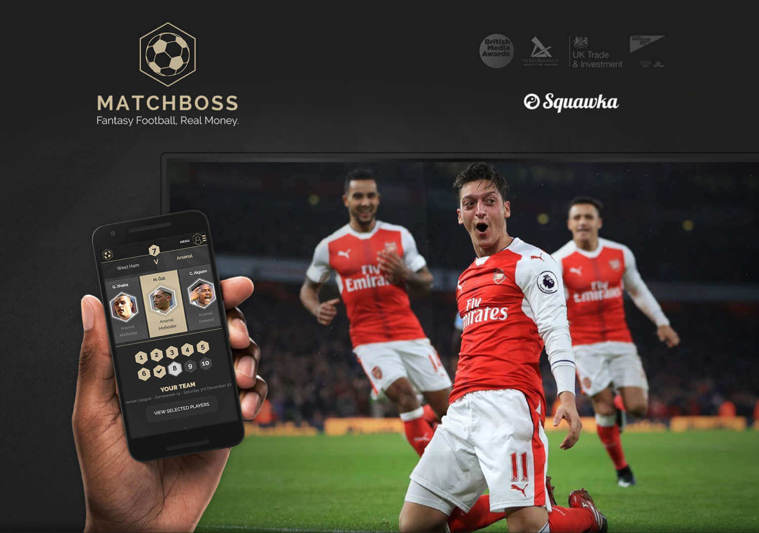
I designed a four-screen path: a landing page carrying the value proposition, a match-specific player carousel, a review screen with a clear route back to selection, and a login screen that appeared only at the point of commitment. A numbered 1 to 10 tracker and persistent Your Team panel kept progress visible.
Existing users were routed from selection into Submit Team and a lightweight login. New users entered a separate registration path ending in a welcome email rather than being forced back through submission in the same pass.
One always-correct primary action
A single Smart Call to Action swapped the primary button by contest state and user progress: Select Your Players at zero picks, Complete Your Selections between one and nine, Submit Your Team at ten, Enter Live Contest once the contest opened, and View Final Results once it closed. It also covered edit and re-open states, so the primary action reflected where the contest was, not only where the user was.
The landing page
The proposition was placed above the fold: the strapline, prize figure and repeated hexagon CTA. A Watch How It Works film taught the mechanic without requiring users to read the rules. A One Game, 3 Ways to Win section separated Match 10, Top 20 and Spot Prizes into three scannable routes rather than a wall of terms. Squawka and Opta credits tied the prizes to licensed data.
An interaction style guide ahead of build
Collected on 12 April 2016, before the beta, the style guide specified motion and component states rather than handing over loose animations. It covered six selected-player-card states, three header variants for guest, transparent and sticky modes, a sticky Your Team panel, and selection navigation and scroll behaviours. The header variants made the authentication decision concrete enough to survive implementation.
Live game
/live/match-10 took 13,290 views from 5,527 unique visitors, with an average time on page of 2 minutes 8 seconds against a site average of 46 seconds. It was roughly three times stickier than anything else on the site, although that still represented only two minutes of a ninety-minute match.
The share loop, and how it changed
Submission generated a templated post carrying the picks, a link and the #MatchBoss hashtag. The copy changed across the season and is dated in users' public posts:
- December 2016 to January 2017: "Here are my 10 #MatchBoss MOTMs for Premier League - Gameweek N:" with a link to the user's profile page.
- March 2017: "I've entered my 10 #MatchBoss MOTMs for Premier League - Gameweek 27. Come and join me!"
- April to May 2017: "I've entered my 10 Squawka #MatchBoss MOTMs for this weekend's contest, so come and join me. 25 WINNERS EVERY WEEK!"
The progression moved from declaration, to invitation, to invitation carrying the odds. Whether the share copy was owned by me or Content Design remains an open item.
Decisions
Retitling rather than shortening step three. The survey said the form was fine. The funnel said it was the worst screen in the product. I trusted the funnel over the stated preference and treated the fix as explanation rather than reduction. Removing a compliance field was never available. Explaining it was.
Deferring authentication to the point of commitment. Letting people play before signing up got them into the game, then took the cost at the worst possible moment, after they had done all ten picks. 296 completed teams were abandoned at that gate. I would still defer login, but I would make the cost visible at pick one rather than letting a user discover it at pick ten.
Rewarding failed actions in the scoring model. This sacrificed a simple realism rule in exchange for a live view where every pick could still move. It was a game-design decision made for a retention reason.
Progressive disclosure on the prize structure. Three tiles and three pages gave users a route through the prize logic without turning the landing page into a comprehensive terms document. The landing page's first job was to get someone to a first pick.
Sharing the submission, not the result. The share fired when a team was locked, which was the moment of most confidence and least information. It worked as acquisition and did nothing for return, because by the time there was a result worth boasting about, the loop had already fired.
Impact
The registration work landed. Step three was the largest drop in the funnel, was diagnosed from two independent sources that agreed, and was fixed by naming the reason for the ask. The reported improvement was around 35%, but it is not verifiable from surviving records and is therefore reported, not measured. The validation defect means the two effects cannot be separated.
The live view was the strongest surface in the product. Across gameweeks 6 to 13, the in-play email drew an average 55.1% open rate and 23.5% click rate, the highest click rate of anything sent. The results email opened highest at 60.9%. The email asking people to enter opened lowest, at 37.7%.
That ordering is the finding. People would open a live match and open a result. What they would not reliably do was come back to pick a team.
The product retained a core and lost the casuals. Between gameweeks 6 and 13, the mailing list grew from 493 to 950 recipients while entrant sends fell from 495 to 374, a decline of around 24%. The record still needs confirmation that the in-progress and results sends were segmented to that week's entrants, so this comparison is presented with that caveat.
Underneath that decline, a committed group stayed for the whole season. One player publicly recorded a £150 win in July 2016, a £250 win credited in January 2017, and was still following the contest in March 2017. Other public posts showed entries in April and May 2017. The split matters more than the average: the game held people with money and a leaderboard position at stake, and lost people who submitted once and had nothing to come back for.
The research had already predicted exactly that. In July, users said there was nothing to do once the team was locked and that they had forgotten about it. When asked what they wanted next, 46% chose a full list of every player and their scores, while 30% chose a timeline of their players' events during the match. For additional information, 45% chose comparing players within a team and 42% chose a breakdown of each player's score by stat. 73.5% wanted their team public and wanted to see other people's.
Every answer pointed at the same hole: the contest ended for the user at submission, and the product did not make the next gameweek feel like a continuation of the last.
On launch day for the Premier League run, a user built one of those missing features by hand. On 24 September 2016, someone posted that fewer than one in a hundred players had picked Chris Smalling as their man of the match. That was aggregate selection data used as social content, produced manually by a player on day one, because the product would not show it. The research had asked for it in July.
The recovery attempt. A win-back email to non-completers went to 1,749 recipients. It achieved a 30.45% open rate, 6.30% click rate, or 110 unique clicks, and a 2.98% unsubscribe rate. It framed age verification as something the user had to finish to remain eligible for prizes and carried an apology for a defect rejecting Irish mobile numbers beginning 08. Part of the step-three drop-off had been validation failure that the funnel could not distinguish from hesitation.
What happened to the product. MatchBoss ran the full 2016/17 season, roughly eight months from the Euro 2016 beta. Squawka later entered administration, and on 14 December 2017 Catena Media acquired Squawka.com and related assets for an upfront payment of £1 million, with the daily fantasy sports platform still described as being in beta. Four employees moved across. I had left the company by then. The game did not fail. The business that ran it did.
Reflection
What worked. Running behavioural and quantitative evidence at the same problem and only acting where they agreed. The interaction heatmap and the registration funnel both pointed at the same screen, which is why the fix was worth building. And treating a compliance requirement as content rather than as an obstacle: the honest answer to "why do you need this" was available the whole time, we just had not put it on the screen.
What I would change. We had the retention diagnosis in July, in users' own words, and shipped the Premier League season without answering it. The features they asked for, a full player list with scores, a per-player event timeline and comparison against other entrants, were not exotic; they were the obvious continuation of a product built on a live data feed, and we had the feed. Within a day of the Premier League launch, a player was posting selection percentages they had worked out themselves. I read the research as a wish list for version two rather than as a description of a hole in version one.
What stays. The funnel showed the hard part was never the game. People would happily pick ten footballers. They would not start without knowing what it cost them, hand over identity data to a screen that would not say why, or come back the following week to a product that ended when they pressed submit. The people who did come back were the ones with money on it.
What was mine. I owned the interaction style guide and component states, the four-screen selection and submission flow, the authentication decision, the Smart Call to Action model, the 43-event scoring system, the landing-page architecture and three-tile prize disclosure, and the funnel analysis that drove the step-three redesign. The research programme itself was co-authored.
Prototype
The prototype covered the full four-screen path: landing, player carousel, review and submission. Selection ran through a match-specific carousel rather than a pitch. A numbered 1 to 10 tracker and a persistent Your Team panel kept progress in view, and a single primary action changed with the contest state and the pick count. I tested it internally first, then in beta against the Euro 2016 contest.
Disclosure
Figures are taken from analytics and email exports, the user research report dated 6 July 2016, contemporaneous Squawka promotion and dated public posts, all from my records of the project. The registration completion improvement of around 35% is reported from memory and is not verifiable from surviving records, so it is stated as reported rather than measured. Prize figures relate to distinct contests and are not cumulative. The Euro 2016 and Premier League prize figures are corroborated by Squawka's contemporaneous promotion and dated public posts. The £1,000,000 insured jackpot is excluded pending a dated April or May 2016 source for the revised covered amount.
Details of the Catena Media acquisition are matters of public record. Public posts referenced here are cited privately and individual handles are withheld. Some information has been excluded for confidentiality, and no confidential or proprietary information from Squawka is disclosed here. The work shown represents my own contribution and does not necessarily reflect the views or strategies of the business.
Some information and details have been excluded for confidentiality. This material is presented for portfolio purposes and does not disclose confidential or proprietary information from Squawka.
Key facts
- Client
- Squawka
- Year
- 2016
- Role
- Lead Product Designer, game experience and conversion
- Industry
- Football Media Company
- Location
- London, UK
- In-play email open rate
- 55.1%
- In-play email click rate
- 23.5%
- Results email open rate
- 60.9%
- Sign-up conversion
- +35%
- Order conversion
- 37.7%
What was the challenge in Squawka MatchBoss?
MatchBoss asked football fans to hand over real identity data, including name, email, username, date of birth and phone number, inside a match-day countdown running down to the second before submissions locked. Compliance and urgency were pulling against each other on the same screen.
What did I actually do on Squawka MatchBoss?
The failing screen was titled More Information . It asked for date of birth and address without saying why, in a product that had just promised cash prizes. I retitled it Proof of Age / Identity and explained the reason for each field at the point of asking. The regulatory requirement became the answer to the user's question instead of a neutral label hiding the reason.
What was the outcome of Squawka MatchBoss?
The registration work landed. Step three was the largest drop in the funnel, was diagnosed from two independent sources that agreed, and was fixed by naming the reason for the ask. The reported improvement was around 35% , but it is not verifiable from surviving records and is therefore reported, not measured. The validation defect means the two effects cannot be separated. Measured outcomes: In-play email open rate: 55.1%; In-play email click rate: 23.5%; Results email open rate: 60.9%; Sign-up conversion: +35%; Order conversion: 37.7%.