what3words Ltd
Addressing & geocoding System

2018
London, UK
what3words Map App
Helps everyone talk about everywhere
Lead Product Designer on the what3words map app, 2018. The company had a working address system and very few people using it, and the research found that the map was the barrier rather than the addresses. This is what we changed and what it cost.
- 30Languages supportedLanguages the three word address system was published in.
- 6.9 to 24.4 charactersAddress length, averageAverage three word address length across the top 10,000 addresses per language, lowest (Chinese) to highest (French).
- 12 to 57 charactersAddress length, maximumLongest three word address per language, lowest to highest.
Context
what3words gave every 3m by 3m square on Earth its own three word address. I joined in 2018 as Lead Product Designer and led the map app from London.
I set up the design practice from the ground up: the way the work moved, the UX strategy, and a React design system the other products were built on. I grew the team to four permanent designers and a group of freelancers, and worked with the executives and partners who shaped the product range.
Challenge
The company had a working address system and very few people using it. The research found the reason. Many of the people we watched had never used a map before, and even confident users could not point to their own front door on one. A three word address is only useful once somebody can find the square it belongs to, so the map was the thing standing between the idea and the people it was for.
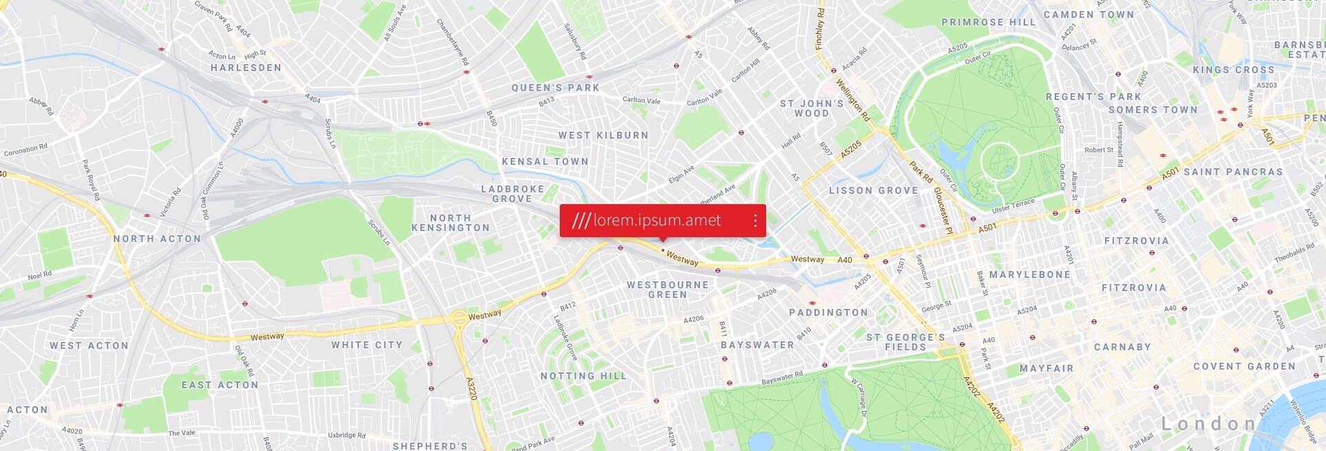
That made the map itself the design problem. The grid is 3m by 3m squares, which are far too small to exist at the zoom levels people browse at, so the app had to decide what to show and when. The marker had to stay readable while the map moved under it, and it had to say something different when a place was only selected, when it was saved, and when it had been given a name. A three word address is also a different length in every language it is published in, so whatever we drew had to hold text of very different sizes without breaking.
Approach
Audit what addressing actually does
I started by looking at how addressing works in practice. Street addresses were often inaccurate or ambiguous. Road names repeated. Homes and businesses sat a long way from the centre of their postcode. Whole places had no address at all, from informal settlements to the park where people had arranged to meet. Around four billion people live without a formal address.
Bring the field research back to the room
I ran the research on site and then took it into internal workshops, where we went through the findings together and agreed what the real user problems were. Search, refine and save were not separate features but the three core scenarios from which the product needed to be designed.
Build around those three scenarios
Search accepts a three word address or an ordinary street address, so nobody has to learn a new habit before they can start. Refining is what turns a rough tap into the exact square, and it is the step the research said people needed most help with. Saving turns a square into a place with a name, which is what makes an address worth keeping. I worked alongside the engineers on the Google Maps integration, so the map underneath stayed familiar while the layer on top was ours.
Decisions
The grid appears at zoom 19, not before
The map reveals detail in stages: continents around zoom 5, cities at 10, streets at 15, the three word grid at 19, individual buildings at 20. The alternative was to draw the grid whenever the map was open, which is the most direct way to teach what the product is. We did not, because at city zoom the squares are smaller than a pixel and the grid turns into a grey wash that hides the map underneath. The cost is that a first time user does not see the idea until they have zoomed a long way in, so the rest of the interface has to carry the explanation until then.
The marker changes shape rather than carrying a status label
A location is floating while it is only selected, locked once it settles on a square, saved when it is kept, and named when it has a label. Each of those is a different marker rather than the same marker with words beside it. The alternative was one pin and a status line, which is cheaper to build and far cheaper to translate. Four markers cost more design and engineering time and one more thing for the design system to hold. What they bought is a map that can be read at a glance while it is still moving.
The address resizes itself instead of being given a fixed size
Three word addresses are published in more than twenty languages, and the same address is a different length in each. The alternative was to set the type once and cut whatever did not fit, which keeps a layout stable. Cutting an address destroys it, because all three words are needed to find the square, so the type scales to the space and to the number of characters instead. The cost is that the address is not always the same size on screen, which makes it a weaker visual anchor for everything designed around it.
Look unlike Google Maps while being built on Google Maps
We integrated Google Maps through its APIs, so the tiles underneath were the ones people already knew. The alternative was a different base map provider, which would have given us control of the cartography itself. Staying with Google kept the map familiar and the integration proven, and it cost us the ability to change the base map at all. The difference had to come entirely from what we put on top: colour, typography and iconography.
Results
We tested the MVP against the three things the product asks of a first time user: understand what a three word address is, save a location while registering an account, and use an address to get somewhere. The validation readout from those sessions is below.
After release the pattern in feedback was consistent. People found the app straightforward and it grew steadily. Bugs on Android were the clearest drag on that, and they came up more often than any complaint about the interface. The most common request was not a feature. People wanted to understand how the system works well enough to explain it to somebody else, which is the same adoption problem the research had found, showing up again on the other side of the launch.
Reflection
What I would change is the order. We treated explaining the system as something the interface would do on its own, and the strongest signal after launch was people asking for that explanation directly. Teaching should have been designed as part of the product rather than left to the map to imply. The ideas I did not get to build were about turning a saved place into something worth sharing: lists that can be private or public, locations that carry a story, and a link to the 3wordPhoto app so a photograph and a place travel together. Those are my own ideas rather than the company's plans.
Prototype
The prototype covered the three tasks end to end: find and save an address, navigate to one, and share one. It ran as a connected flow rather than a set of separate screens, so the movement from finding a place to correcting it to keeping it could be judged as one gesture instead of three.
Tools and skills
Set the strategy the product range was designed against.
Built a React design system the other products were based on.
On site observation of how people read maps and share places.
Internal sessions to read the research together and agree the problems.
Connected high fidelity flows for find, save, navigate and share.
Grew and led four permanent designers and a group of freelancers.
Technology
The base map and geocoding, integrated with the engineering team.
Converts between coordinates and a three word address, in both directions.
The shared component base across the product range.
Native apps, including the voice search that only ran natively.
The same product on the web, for people who arrive from a link.
Accessibility
On a map, information density is an accessibility decision. What the app draws is tied to the zoom level, so a screen never carries more than it can render legibly, and the grid only appears once its squares are large enough to tell apart. The three word address itself is specified per writing system, with a typeface, weight and size for each, so an address set in Arabic, Chinese, Japanese, Mongolian or Hindi is as readable as one set in English.
The system supported 30 languages, and the constraint turned out to be sharper than expected. We measured the average three word address length across the top 10,000 addresses in each language: it ranges from 6.9 characters in Chinese to 24.4 in French, a spread of three and a half times. The maximum runs from 12 characters to 57, nearly five times, and all of it has to sit in the same marker on the same map.
A component sized for English fails in both directions. English averages 21.1 characters and tops out at 54, so it sits near the worst case for Latin scripts: French, German and Finnish overflow a component built around it, while Chinese and Korean leave it looking empty, which on a map marker reads as a bug rather than as a short address. That ruled out a fixed treatment and made responsive resizing a structural requirement rather than a polish item. The rule had to live in the component, not in a guideline, because every language variant would otherwise have to be caught by review.
Delivery and rollout
The work moved through staged delivery, with fixed points for review, iteration and sign off, then validation before release, and then it repeated. Research, analysis, design, build and test each had a place inside a stage rather than a phase of their own. That is what let a feature go out, come back for revision and go out again without stopping everything around it.
Disclaimers
Some of this work is not shown. What is withheld is what what3words treats as confidential, under the Data Protection Act 2018 and the Computer Misuse Act 1990. What is shown is used for portfolio purposes under fair dealing, sections 29 and 30 of the Copyright, Designs and Patents Act 1988. Every address in these screens is a placeholder from design review rather than a real saved location, because a three word address is precise enough to identify where somebody lives. The views here are mine and are not the company's positions.
Key facts
- Client
- what3words
- Year
- 2018
- Role
- Lead Product Designer
- Industry
- Addressing & geocoding System
- Location
- London, UK
- Languages supported
- 30
- Address length, average
- 6.9 to 24.4 characters
- Address length, maximum
- 12 to 57 characters
What was the challenge in what3words Map App?
The company had a working address system and very few people using it. The research found the reason. Many of the people we watched had never used a map before, and even confident users could not point to their own front door on one. A three word address is only useful once somebody can find the square it belongs to, so the map was the thing standing between the idea and the people it was for.
What did I actually do on what3words Map App?
I started by looking at how addressing works in practice. Street addresses were often inaccurate or ambiguous. Road names repeated. Homes and businesses sat a long way from the centre of their postcode. Whole places had no address at all, from informal settlements to the park where people had arranged to meet. Around four billion people live without a formal address.
What was the outcome of what3words Map App?
We tested the MVP against the three things the product asks of a first time user: understand what a three word address is, save a location while registering an account, and use an address to get somewhere. The validation readout from those sessions is below. Measured outcomes: Languages supported: 30; Address length, average: 6.9 to 24.4 characters; Address length, maximum: 12 to 57 characters.